Hyams Store
Building Highlights
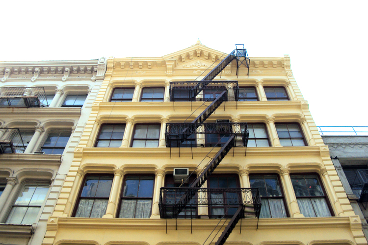
23-25 Green Street is one of the best examples of cast-iron architecture in New York City’s Soho-Cast Iron Historic District. The building was designed and developed by Isaac Duckworth. Construction commenced on July 10th 1872 and was completed on February 28th 1873. The building was originally designed as a store and warehouse for the owner J.E. Hyams. Duckworth designed several other structures on Greene and Broome Street in the early 1870’s including the two across the street at 28-30 and 32 Greene Street.
Building History & Stories
After the Civil War, New York flourished as the commerce and financial center of the country. During this time Soho began its transformation from the city’s entertainment district into a commerce district. Soho’s success as a commercial district was due in part to its close proximity to the city’s largest business market and the North River docks. Projects like expanding Laurens Street, now West Broadway, which the City of New York embarked upon in 1870s also helped fuel the transformation. New structures were erected to accommodate the influx of textile and industrial firms that were leading the country’s mercantile and dry good trade.
23-25 Greene Street was designed and built during this period by Isaac Duckworth as a store and warehouse for the owner J.E. Hyams. Construction commenced on July 10th 1872 and was completed on February 28th 1873. Iron was provided from Aetna Iron Works. The architect Isaac Duckworth developed a reputation for creating buildings that transcended an atmosphere worthy of a great commercial palace. 23-25 was considered no exception; though, it was achieved with fewer elaborations then some of Duckworth’s other buildings.
Much of the original construction remains. The doors have been replaced and the bases of pilasters on the ground floor were altered when the stoop was added.
Architecture Notes
23-25 Green Street is a striking five-story building with a cast-iron facade articulated in the French Renaissance style. The structure is crowned by a triangle pediment roof and symmetrical cornice trim set directly over the two central window bays. The building is flanked by two vertical rows of cornerstones or quoins intended to resemble that of stone construction. The cast-iron moldings are used to give the building a bold, almost regal character. Sparsely-leaved Corinthian columns that are partially fluted separate the window bays. The uniform character of the building creates a sense of formality. The brackets and decorative modillions are simple enough in design so that they don’t detract from and rather compliment the rosettes in the center of the horizontal bands of frieze panels.


